It was Nagy’s expressed desire not to present a fictionalized, nostalgic version of the 1960s. “We already had enough of that,” she says. “I wanted to show how real people, even without a lot of money, dressed, what their homes looked like and how they furnished. We were careful never to slip into this myth of what the ’60s were supposed to look like. I lived through that time as a little kid, and what we see in movies, these wonderful, opulent reinventions of the mods and such, doesn’t correspond to the world I remember.”
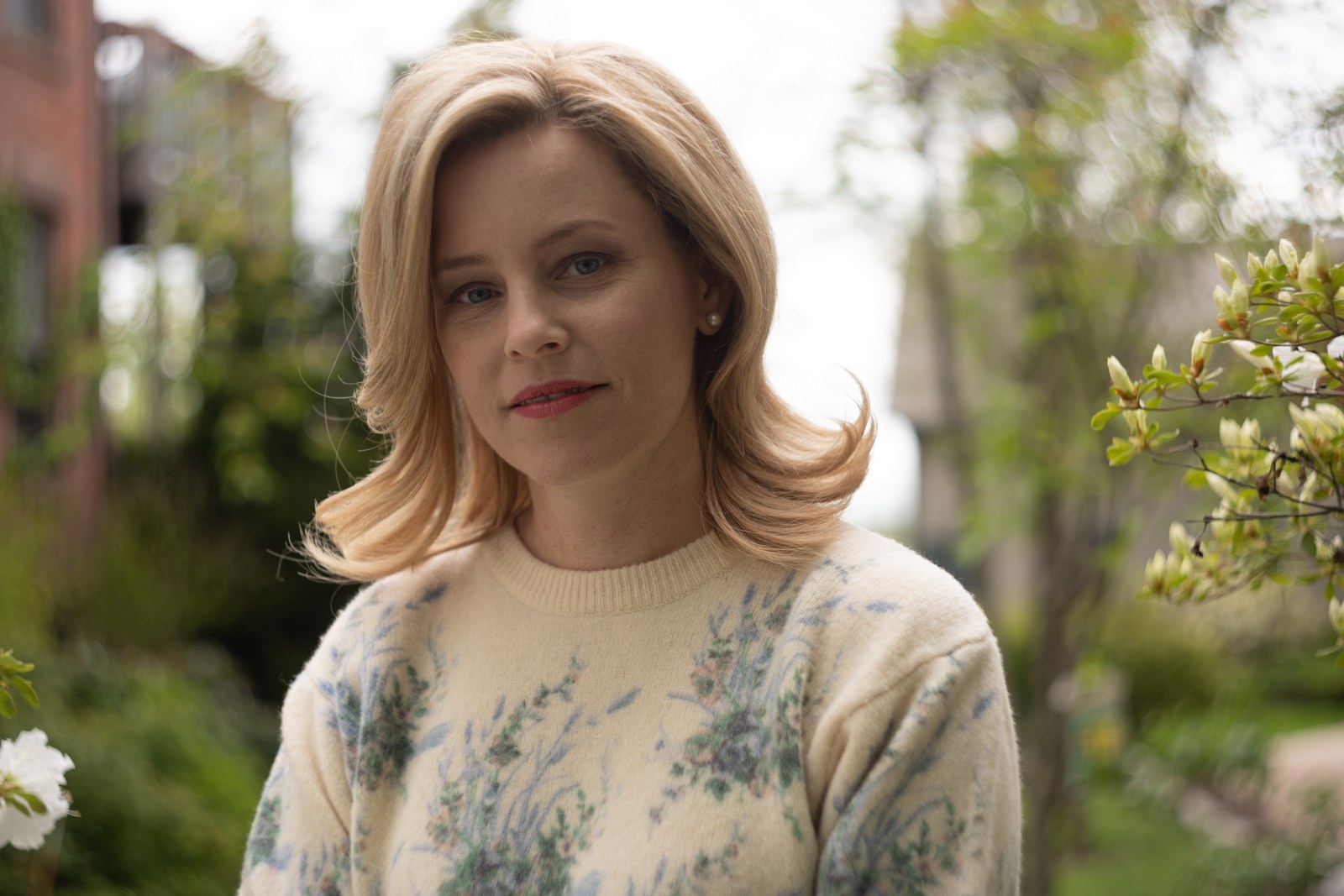
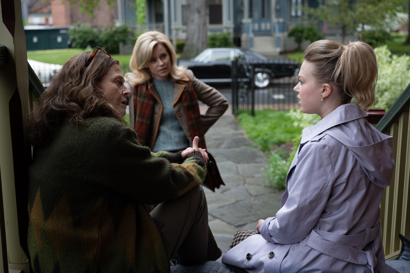
Nagy already had an accurate idea of the film when she first met Greta Zozula (ONLY HALF THE STORY, MATERNA, LIGHT FROM LIGHT), the film’s cinematographer, and quickly realized that she and Zozula were on the same wavelength. Their first conversation was about Vivian Maier, a photographer who spent decades photographing the people and architecture of Chicago while also working as a nanny. Maier’s work is valued for its honesty and structural aspects. Her color photographs gave Nagy, Zozula, production designer Jona Tochet (THE LAST BLACK MAN IN SAN FRANCISCO) and costume designer Julie Weiss (THE ICE PRINCESSES, 12 MONKEYS, FRIDA) ideas for the film’s color scheme, which highlights various shades of brown, maroon and blue.
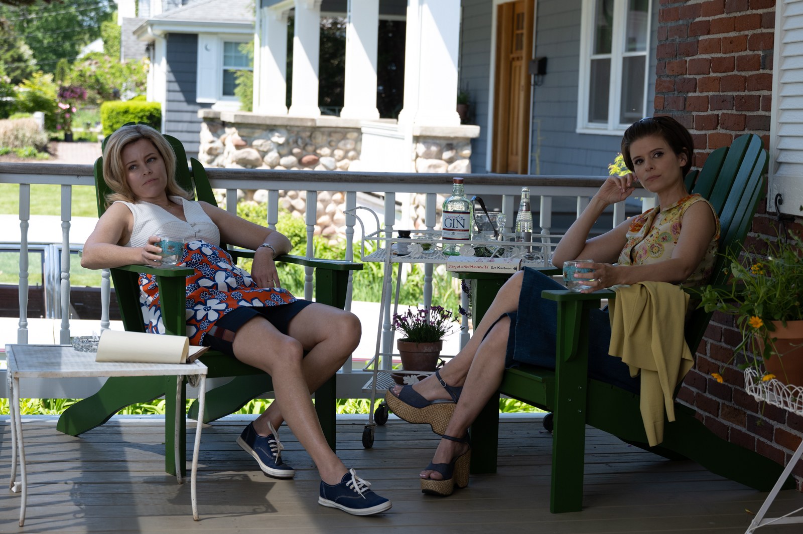
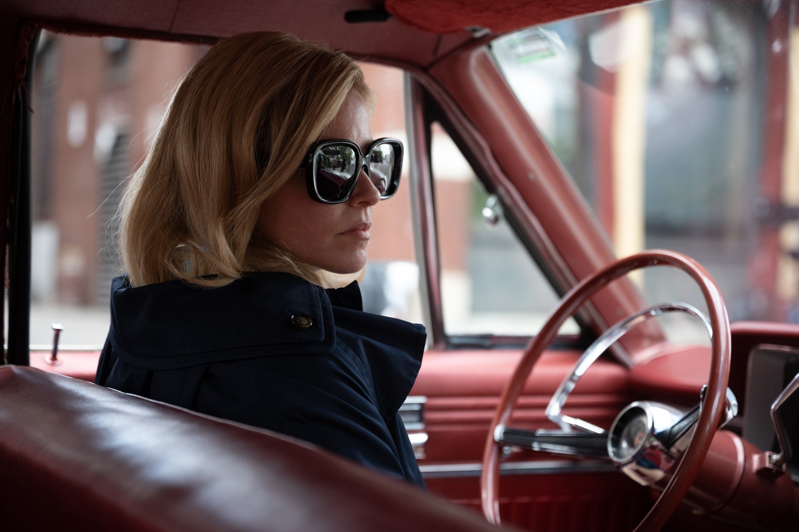
The team used specific colors for some of the protagonists. For example, Joy’s storyline is reflected in a variety of blues, while Dr. Dean, a character portrayed as both sympathetic and seedy, is surrounded by yellows. A pivotal scene in the doctor’s home plays with the blue and yellow color scheme as the protagonist and protagonist circle each other. Another challenge for Zozula was to visually translate this story, which feels so authentic, and accurately depict the turbulent times without resorting to metaphors. “We didn’t want to just pretend we were shooting in the ’60s and being up close and personal,” she says. “Shooting in Super-16 was the first step in escaping that. It gave the film texture and depth, and it’s quite fault-tolerant.
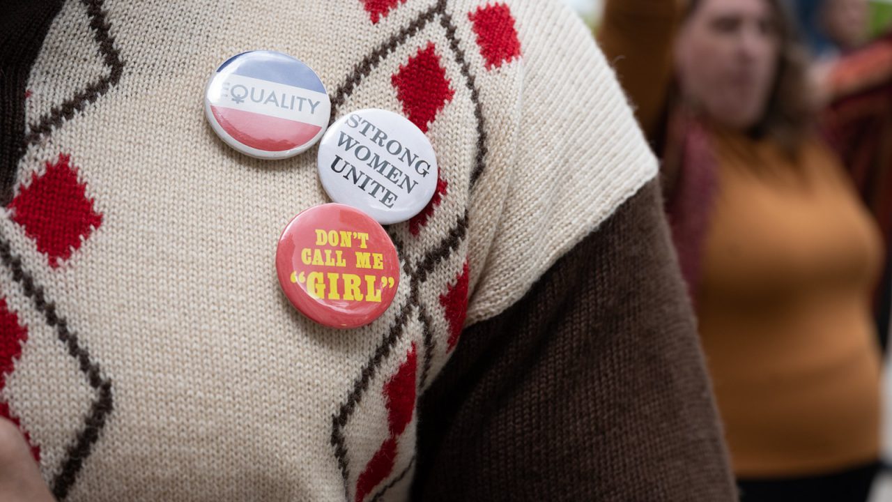
To avoid a “vintage look” that wouldn’t have fit, and to compensate for the 16- mm, Zozula used fast lenses that allowed for a wide range. In addition, she filmed with a Steadicam to emphasize the atmosphere and personality of the protagonists with freer framing. Jona Tochet did extensive research on buildings and masonry in 1960s Chicago. She paid particular attention to things that were preoccupying the country around 1968: the assassination of Martin Luther King, the protests against the Vietnam War, and the second wave of the women’s movement. With this information in mind, she sketched the environment of all the protagonists.
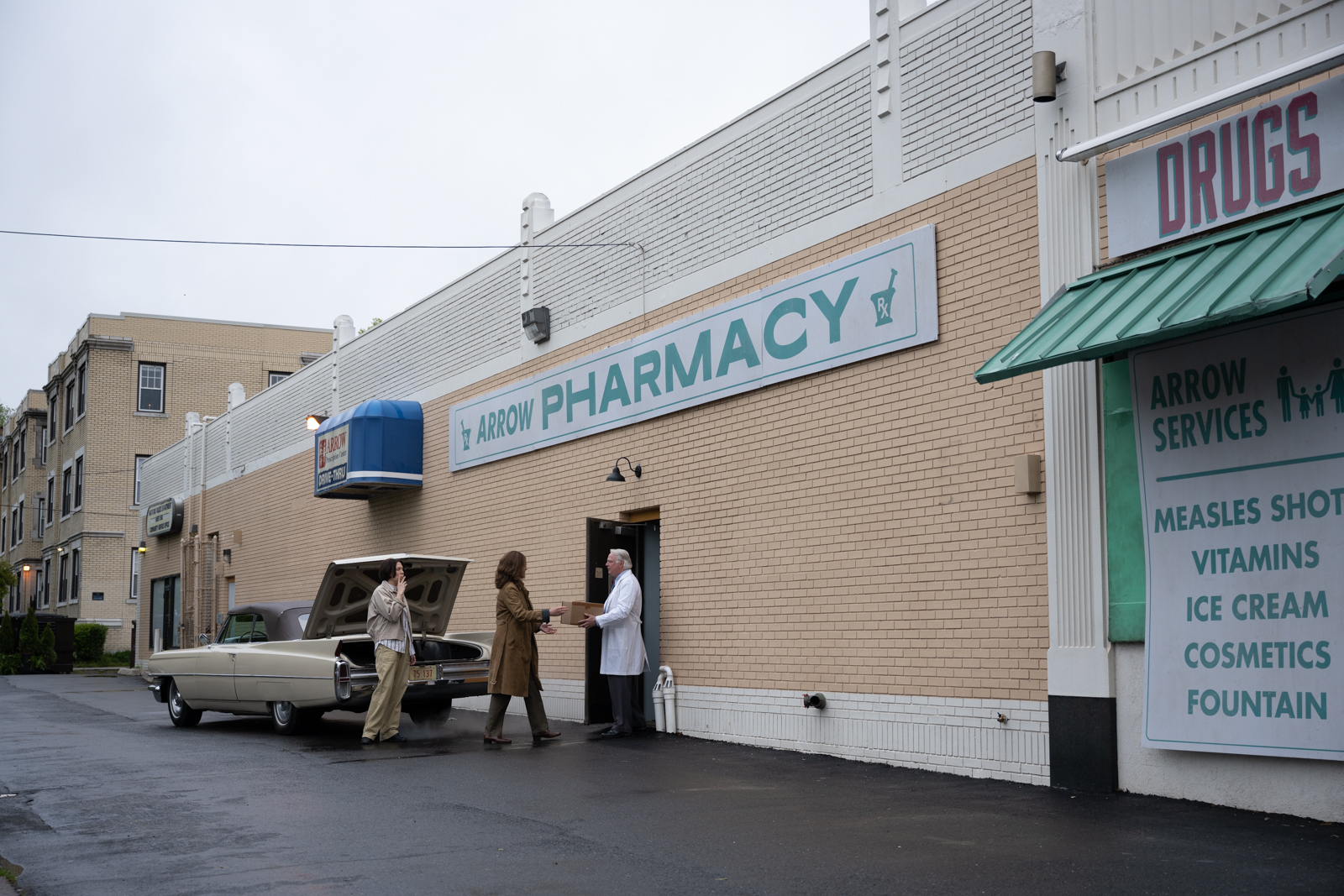
“Jonah dove in,” Brenner says. “She was one of the first on the scene. She went into antique stores, junk stores, and she designed some of the spaces for the film, including the set for the abortion scenes. That in particular was incredibly important, because it’s a very intimate, very haunting environment. Jonah made sure it was a protected place for the actors and actresses, and the set never gives the impression that it’s in an apartment or any kind of store.” Joy and Will’s house serves as a subtle showcase for the changing family dynamic. “Joy is of Swedish descent, and she and Will are portrayed as more modern than their surroundings,” Tochet says. “I used a lot of Mid-Century accents like clear spaces and light wood. But as Joy becomes more involved in the Janes’ cause, I added decor that illustrates her journey from suburban housewife to pro-choice activist.”
Nagy relied entirely on Julie Weiss, with whom she previously worked on the film MRS. HARRIS – MURDER IN BEST CIRCES. “Julie is a legend, a genius with great vision,” Nagy says. “She did a great job for the film and was one of my most important collaborators.”
Weiss approached her work from the perspective of the protagonists, assembling entire wardrobes full of clothes for the main characters. Even before she began the designs, she considered how and where each person would buy their clothes. Her deep understanding of the development of the protagonists, especially Joy, is reflected in the smallest details of each costume.
